We need to stop talking about ‘stripped back’ design and the death of craft
Craft is dead. Reductive design is the new aesthetic. Visual storytelling is the cornerstone of brand expression, yet minimalism is all we have time for. There’s so much oversimplification and contradiction in our analysis of design right now, it could be dangerous to your intellectual health to believe any of it. So what should you believe? Has design got its reductive groove on? Is it here to stay, or is it just a trend?
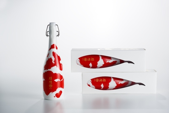
The Design Lions at Cannes provided a few clues. Tokyo agency Bullet’s beautiful use of red and white are used to dramatic effect in this pack design for Japanese sake, in which the curves of a white porcelain sake bottle are reimagined as the body of a koi carp are simple and seductive. These strikingly simple posters for the World Table Tennis Championship have a captivating and compelling simplicity, whilst the Sydney Opera House’s lovely new identity is matched by a bold proprietary typeface. So far, so strong and simple.
So is craft dead? I think it depends what you mean by craft. Which is kind of the problem. The expression of ‘craft’ has become detached from its meaning. In our pursuit of brands with a sense of soul, we mistook the external signifiers of craft for the thing itself, trading in the idea for mere execution. Any product with a textured label, letterpress type or hand-drawn details claimed to be crafted. Overloaded with handcrafted submissions and ornate labels, one of the judges at the packaging award at this year’s D&AD observed that ‘craft has become homogenised’. In other words, when everyone’s unique and quirky then nobody is.
Meanwhile, industry pundits increasingly trumpet the arrival of the new ‘reductive’ aesthetic – one more in keeping with our digital age. Turner Duckworth’s redesign of Coors Beer and Miller Lite, and jkr’s recent work for PG Tips, Budweiser and Domino’s are cited as proof of the new design agenda. But describing a design as ‘reductive’ implies it’s somehow ‘less than’ what it was before. Coke’s famous redesign of 2008 wasn’t about taking away, it was about thoughtful marks; about putting big meaning into small, significant gestures. Miller Lite, for my money, is no less crafted than Booth’s gin. The fact that one has more detail on than the other is a trivial difference.
Indeed, a single brand design can be crafted and simple in the same breath. Take Budweiser, for instance, whose design language is bold and brave, whilst being underpinned with an unimpeachably elegant legacy of craft. Similarly, the Koi sake bottle that won a Bronze Lion at Cannes is as much about detail as it is about simplicity. The detail just happens to be considered, rather than ornate.
Crafted or stripped back – it’s all a little irrelevant. There is only design, and that is the one that is appropriate for a brand and for its context. Domino’s is a mass-market fast food brand, so the visual language of its previous pizza boxes – which were predominantly brown card and ‘honest’ typography – felt not just inappropriate, but downright dishonest. And can you imagine if Coke suddenly adopted the costume of an artisanal soda company? You’d think they’d lost their collective minds – for nothing could be more authentic to Coke’s values than its uncompromisingly bold, simple and optimistic aesthetic.
Perhaps we’re simply getting better at sniffing out the fakers and we’re bored of everyone telling us they’re ‘authentic’, just because they look ‘crafted’. We don’t want craft when it’s just a superficial aesthetic – we want craft when it’s a signifier of genuine quality and care. Similarly, we want brands that are honest about who they are by being authentic to their heritage, spirit and promise.
So in summary, we want brands that are honest, but not preachy. We want beauty, but we also want charisma. We want rich stories but we want to recognize what we love in an instant. We’re a pretty demanding audience. I think that’ll make for some amazing design in the future. I can’t wait to see what’s next.