
How do you design for China? Designing across cultures
Rene Chen, managing director of jones knowles ritchie (JKR) China, and Katie Ewer, JKR Singapore’s strategy director, discuss why now is an exciting time to be designing in Asia.
As a brand consultancy designing in the age of globalization, we constantly have to balance the requirements of creating global brands with the needs of diverse Asian markets, and in particular the most important of them all: China. “You don’t understand, my market is different”, is the perennial bleat of the local market brand manager. “This will never work in China” is almost as common. So how do you design for China? What aesthetic codes do you need to adopt, or at least be aware of, to resonate in the world’s second biggest economy?
A cursory review of the world’s brand landscape seems to suggest that globalization is creating design homogeneity. The diversity of a few decades ago has been reduced to a handful of faceless consumer brands, rubber stamped across the world’s cities with ruthless uniformity. After all, the Starbucks mermaid is unchanging from Seattle to Singapore and to Shanghai. Megabrands speak through the universal language of design – a language that (unlike a TVC or online video) we all understand – regardless of culture, language or geography. Design is the great leveler, the Esperanto of communications.
Well, yes and no. Whilst it’s true that a picture speaks a thousand words, aesthetics are a product of culture, and cultures are unique and changeable. In the 1980s, ‘the West’ was living through boom times. Recession was a distant memory, and people were all falling in love with the Sony Walkman, big hair, shiny Lycra leotards and Michael J Fox. The typography was bold, the colours were bright and neon, and everyone smiled in badly posed photographs through big white teeth. If you compare the visual language of the same geography now, you’ll see that we’re clearly less happy with life. In fact, we’re so worried about the future that we’re all pretending we’re living in the past. It’s called hipsterdom, and until we figure out how to stop climate change and global terrorism, it’s the de facto aesthetic of our age.
So what is the ‘Chinese aesthetic’? What is the spirit of Chinese design, and what are its attributes and codes? Between the culture of copycatting and the love of big Western brands, is there an aesthetic that is truly Chinese?
There’s certainly enough of an artistic legacy to suggest there should be. China has the longest continuous civilization the world has ever seen. In its four thousands years, minimalism, maximalism, expressionism and reductive design have all had their moment. China invented papermaking and printing. You could say that China invented graphic design.
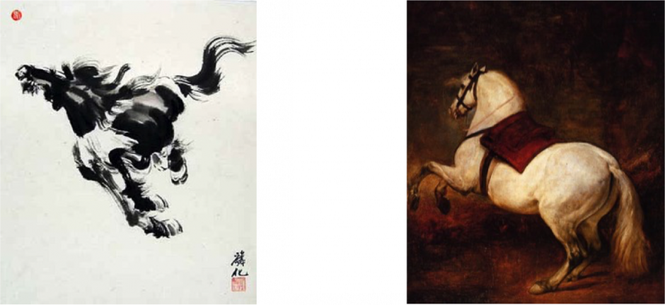
Certainly, a comparison between Chinese and Western art illustrates beautifully how differently our two cultures think about the world.
Take these two artworks of the same subject. The horse on the right – by Velasquez – is a celebration of the artist’s skill. Anatomical precision and the masterful use of light are what are valued here. The horse on the left, rendered within a long tradition of Chinese watercolour, is more concerned with capturing the spirit and the mood of the horse. Its qi, if you like.
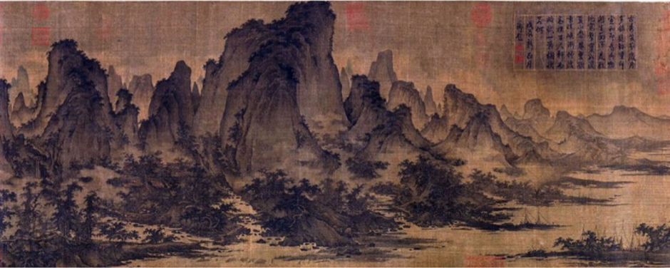
In Chinese art, the whole is more important than the focal point. Context is as important as content. In this Song dynasty (11th century) landscape, realism is clearly not important to the painter. His focus is on evoking a sense of our place in the world (if you look closely, there are some fishermen in the bottom right hand corner). The painting underscores the need for harmonious existence with the world we live in. ‘Harmony’, of course, is a pivotal construct of Chinese society and culture. The artwork is about context; about the whole.
But the Cultural Revolution reset the clock, erasing a centuries-long legacy of art and design. As a result today, many people struggle to conjure a clear image of ‘Chinese design’ with the same ease as they can imagine ‘Japanese design’. Two clichés persist: Chinese design copies Western brands, or else it’s all red, gold and loud. There is nothing in-between.
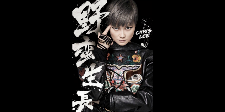
But that is changing as China begins to find its own visual voice. The middle kingdom has only been open to the world for the last 3 decades, and by looking outside of itself, China is beginning to rediscover its own unique artistic soul. Chinese design is more than bottles of Baijiu, LV knock-offs or wannabe brands like Xiaomi and Li Ning. The aesthetic of the new China is raw, vibrant, bold and sometimes chaotic: in some ways a reflection of the country itself.
Check out some of these pieces from contemporary China. Note the fact that there isn’t really a focal point, a structure or ‘a big logo’ – things that are taken for granted in the tradition of ‘Western’ design. Yet there is also an overall feeling of stuff just ‘working together’ somehow. The elements are chaotic, but together the whole makes sense. The artworks are about context; about the whole.
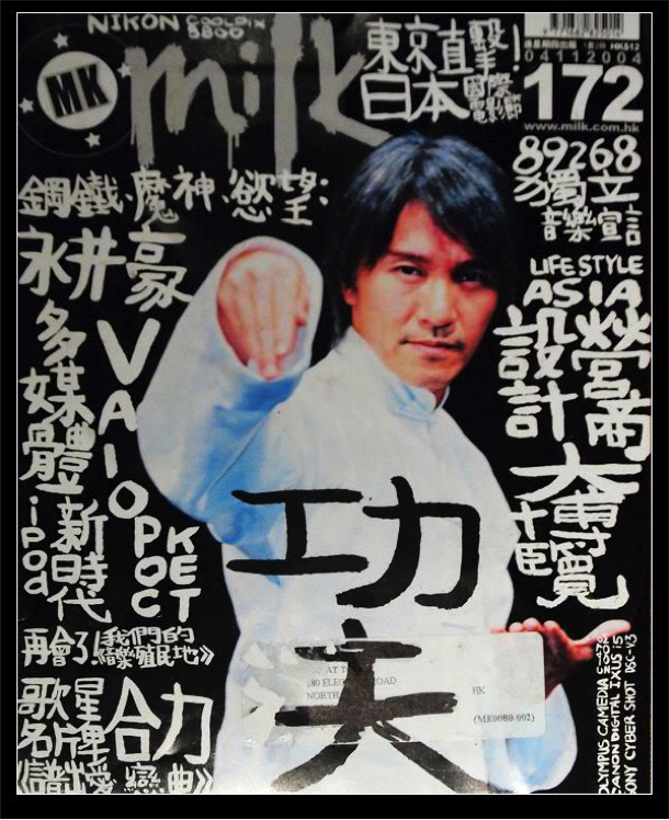
Kung Fu Hustle; copyright Stephen Chow for Milk Magazine, Hong Kong / Kung Fu Hustle; copyright Stephen Chow for Milk Magazine, Hong Kong
Some aesthetics are codified by tradition: red is auspicious so used liberally, gold is imperial and therefore premium. But perhaps this emerging design vernacular – spontaneous, expressive, and holistic – are markers of a way of seeing the world that’s much more deeply ingrained. Not everything in China will look great to those outside it, but that’s okay. As Confucius said “Everything has beauty, but not everyone sees it”.
What an exciting time to be designing in Asia.